2D SUN-PATH
This app lets you dynamically interact with various two dimensional projected Sun-path diagrams. These diagrams all map the sky dome over either a rectangular chart (orthographic) or circular chart (polar), differing only in the location of the zenith point and the trigonometric relationship of each axis.
The aim of this app is to illustrate the relationship between different types of Sun-path projections and the associated chart components. Thus I have tried to animate the transitions meaningfully between each projection in order to visually highlight their differences.
You can also display a World map centered at the current geographic location. Here again I have tried to adjust the map projection to match the diagram such that the path of the Sun throughout the year is faithful to its sub-solar position on the Earth’s surface. This is only really possible in the polar diagrams, but I discuss this in more detail below.
Diagram Types
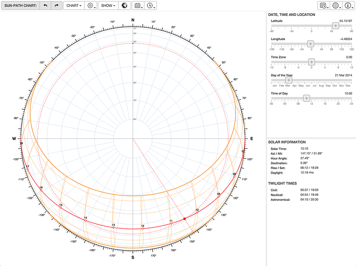
Sun-path diagrams are used in many different fields, some of which are more interested in what happens near the zenith, and others in what happens nearer the horizon. In order to expand those areas of interest, different types of diagram map altitude in different ways. The Spherical projection expands values at the zenith and contracts at the horizon whilst the Stereographic projection does the opposite. The Equidistant projection shows all altitudes the same by using a simple linear scale.
World Map Overlay
An interesting co-incidental quirk of polar Sun-path diagrams is their direct relationship with a spherical world map of the same radius centered at the geographic location of the site. As you move the site around, the Sun-path on the diagram is exactly coincident with the sub-solar path on the Earth’s surface. The term ‘sub-solar’ means that point where a line drawn from the center of the Earth to the centre of the Sun intersects the Earth’s surface. In other words, where the Sun is directly overhead.
The daily sub-solar path at the two solstices lie on the Tropics of Cancer and Capricorn whilst the equinoxes run very close to the Equator. They won’t exactly line up as the sub-solar path actually forms a continuous spiral that winds periodically up and down around the Earth’s surface, whereas the Equator and the Tropics are conventionally shown as parallel latitudinal lines.
The Sun-path/sub-solar relationship makes the most sense within the ‘Spherical Sun-Path’ projection as that is pretty close to how we would visually perceive a spherical world map. All of the other polar projections result in some uncharacteristic distortion that is harder to immediately perceive.
NOTE: This relationship does not extend at all to the orthographically projected ‘Cartesian Sun-Path’. The app will still overlay the world map for visual comparison, but it won’t make any direct physical sense.
Change Log
0.0.1 2014-06-12
- Initial release.