COMPUTER PROGRAMMING
The Earth-Sun Relationship

This applet demonstrates the geometric relationship between the Earth and the Sun, showing the resulting illumination pattern at any time of the day and year for any location. All factors such as declination and the equation of time are fully considered and accurately modelled. It allows you to overlay information such as annual sun paths, important latitude/longitude lines and world time zones. You can rotate around the Earth in any direction or lock into a geo-stationary or view-from-sun perspective. Both annual and daily solar cycles can also be animated to better appreciate subtle effects.
Solar Position and the Sun-Path

Sun-Path Diagrams are a way of modelling and visualising the path of the Sun through the sky at a specific geographic location. With a little interactivity and a small element of play, such diagrams can significantly contribute to our understanding of how the Sun is likely to interact with a building - a concept crucial to the effective design of shading systems. This applet presents just such a Sun-Path diagram, allowing you to interactively change date, time and location as well as viewing it in a range of different ways.
Graph - Robustness Calculator
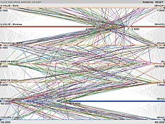
A significant problem in the performance analysis of buildings is trying to understand hugely complex data sets that often results from the investigative process. These types of analysis are usually focused on the potential effect of different design parameters on the performance criteria we are designing to meet. The type of graph described here provides a simple means of interactively investigating and visualising complex relationships that may exist within a large number of calculation runs.
Graph - Annual Temperatures (Google)
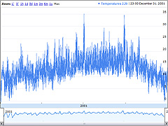
The graph is one of my experiments with Google's Visualisation API as a possible means of interactive web-based data presentation. It's an implementation of an annotated time line graph that Google originally developed for showing stock exchange data - used here to show annual hourly air temperature values. It has to process a whole year's worth of hourly temperature data for San Francisco, so it can take a little while for the graph to first appear.
Graph - Annual Temperatures (Java)
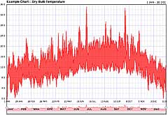
This is an experiment with the use of Java applets to provide highly interactive charts and graphs embedded within a web page. It is just an example so the data it shows is not hugely meaningful - in this case a set of annual hourly air temperature values. However, it is an opportunity to play with my primitive attempt at an interactive and intuitive date range control. This control sits at the bottom of the chart and provides a means for selecting a date range for the values shown.