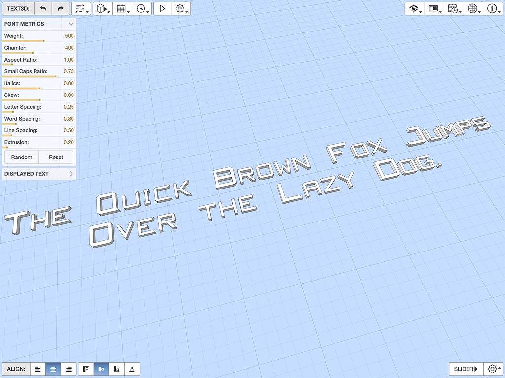
This app is both a comprehensive test framework for my new triangulated 3D font library and an interactive designer that lets you visually customise text to your specific requirements. You can dynamically adjust various font parameters including different shapes, spacings and extrusions. Use the sliders and controls in the top-left of the app to interactively change settings. If you are keen, you can also enter your own text and export the resulting geometry as an OBJ, STL or PLY file.
I wrote this because I really needed to see and experiment with various font shapes, and to thoroughly stress test and optimise the code. Also, automated unit tests can’t really give the same qualitative feedback as actually seeing what different blocks of text look like as various metrics are dynamically adjusted.
This library forms a core part of my tutorial scripting API and is used by the 3D model annotation library as well as several WebGL charts and graphs.
Why 3D Vector Fonts
Whilst the typical approach to 3D text is to texture map font glyphs onto transparent flat surfaces, this is tricky to get looking good especially with large fonts or when you zoom in, and is not totally suited to the kinds of dynamic and animated model annotation I want to be doing.
I had been using my own line-based vector font library for a while, but Chrome version 57 onwards stopped supporting line widths greater than 1 pixel in WebGL on all platforms, regardless of the capabilities of the underlying graphics hardware. As Chrome is one of the most popular browsers at the moment, and single pixel lines on retina and other high resolution displays can barely be seen, I needed to sort something out quickly.
Hence it was out with the graph paper and a couple of days spent refreshing my trigonometry to see what I could come up with.

Designing a dynamic 3D font is way harder than it looks. Standard digital font files use separate glyphs for different weights and italicised versions of each character, whereas I wanted those to just be parameters. Once you parameterise things, all sorts of customisations become possible within the bounds of the basic font shape.


There are still a few configurations of font weight and aspect ratio that cause some self-intersection in one or two glyphs, however on the whole I’m pretty happy with the results. Moreover, it has thus far proved surprisingly fast and quite memory efficient.
Change Log
0.0.1 2017-11-01
- Initial release.
Click here to comment on this page.