PSYCHROMETRIC CHART
This web app displays a psychrometric chart on which you can overlay a range of comfort metrics and psychrometric process lines, as well as loading and viewing EnergyPlus/OpenStudio weather data (.EPW) and output files (.CSV). It smoothly transitions between absolute humidity and relative humidity in the vertical axis to clearly demonstrate why the psychrometric chart is such a useful representation, and to illustrate the core relationships between the Givoni and Olgyay bioclimatic charts. You can also generate ASHRAE Standard 55 and EN-15251 comfort analysis diagrams for inclusion in reports.

The terms psychrometry and psychrometrics refer to the study of moist air and its thermodynamic properties. Whilst obviously important in the design of air-conditioning systems, these same thermodynamic properties are key determinants of thermal comfort within a building, which makes psychrometrics an important part of any passive and/or climate-responsive design process.
Getting Started
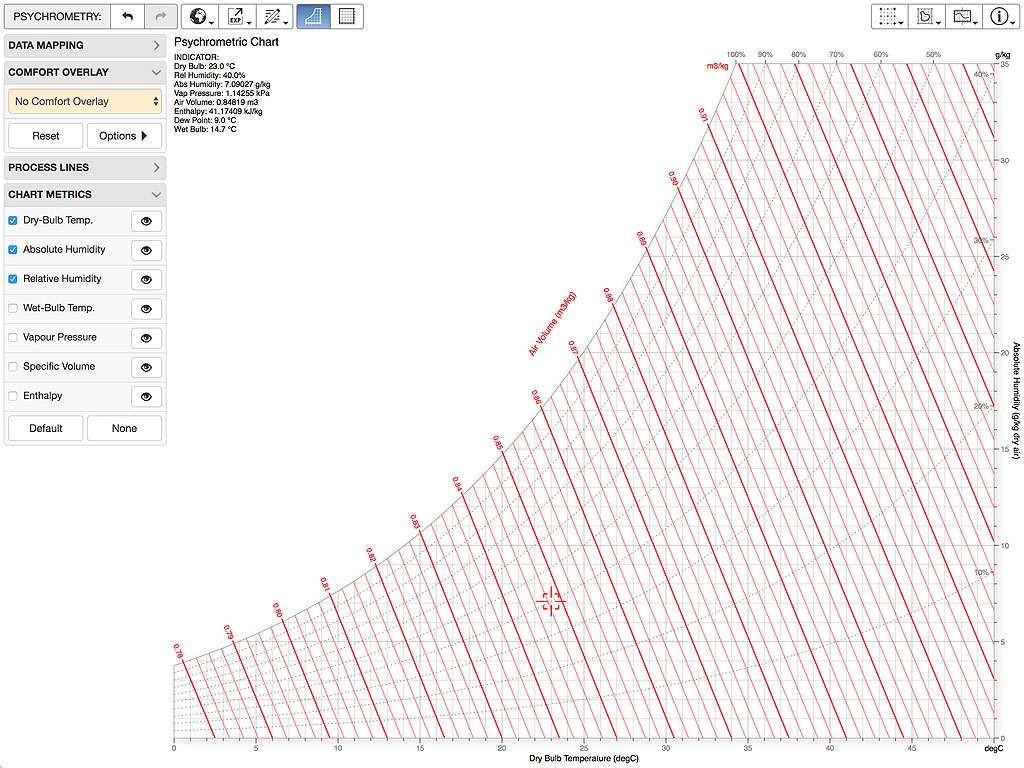
When it first starts up, the app displays a standard empty psychrometric chart. You can choose to add or remove axis lines for a range of different metrics, or even highlight individual axis lines in red to assist with dynamic explanations or interactive presentations. You can do this using the checkboxes and highlight buttons in the CHART METRICS panel located on the left side of the chart.

You can then import a weather data file or even the output from an EnergyPlus/OpenStudio annual hourly simulation run. To do this, either drag/drop the required .EPW or .CSV file into the browser window containing the psychro-chart application or select the Load EPW… or Load CSV… buttons in the DATA MAPPING panel.
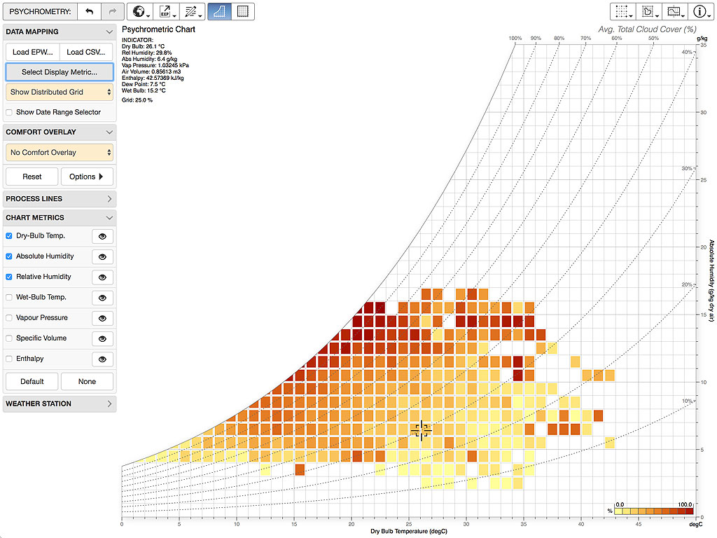
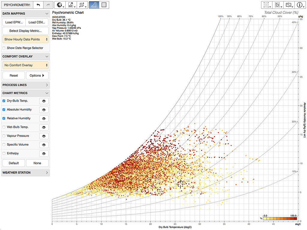
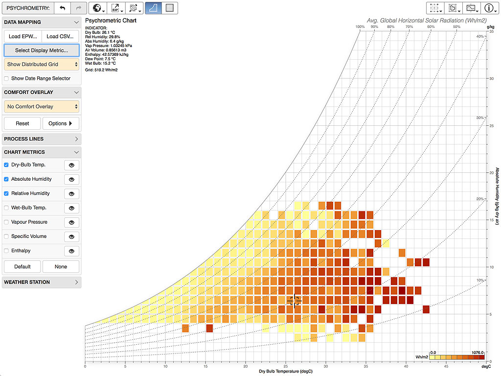
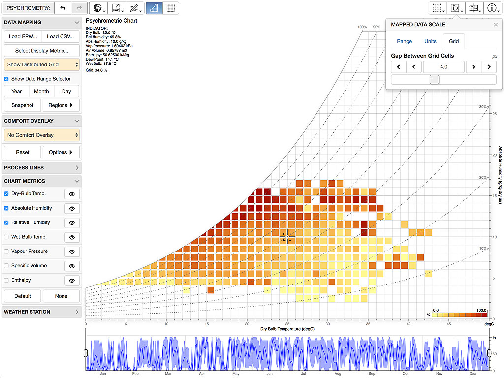
Once loaded, you can display the data using a grid, as individual hourly data points, as monthly min/max lines or as a daily outline, as shown in Figure 3. This can done using the selector in the DATA MAPPING panel or in the SELECT DISPLAY METRIC dialog box.
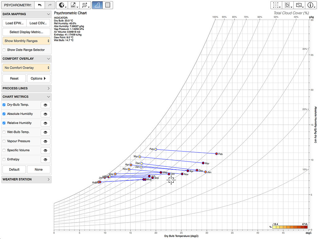
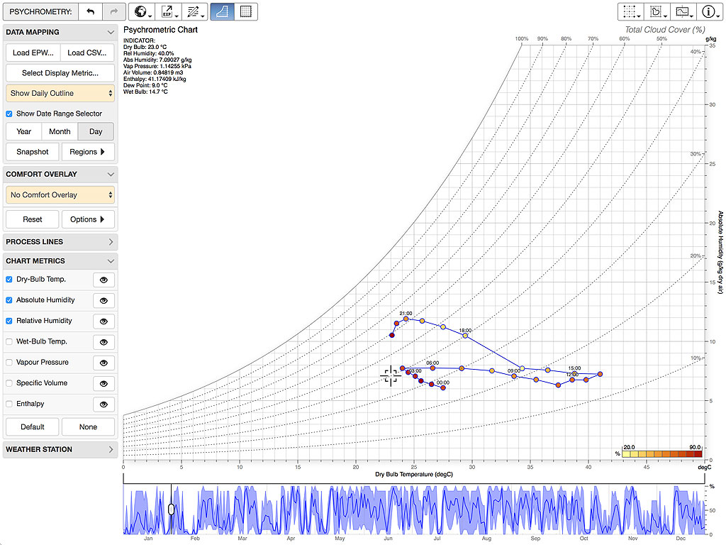
The lines that define each mean monthly average are drawn from the average daily minimum temperature and average daily maximum relative humidity to the average daily maximum temperature and average daily minimum relative humidity. When a metric is displayed, the average minimum daily value is shown at the minimum temperature point and the maximum at the maximum temperature point.
Display Metrics
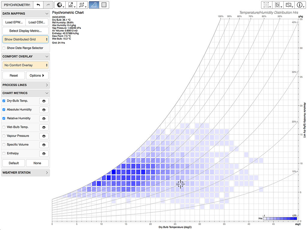
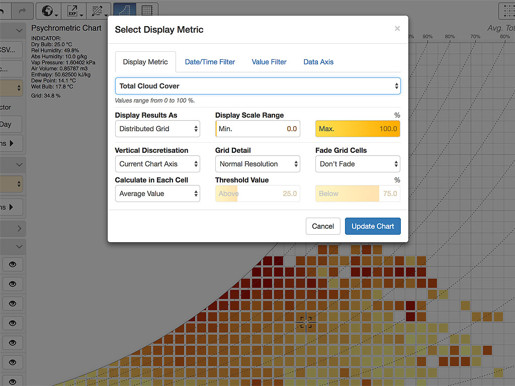
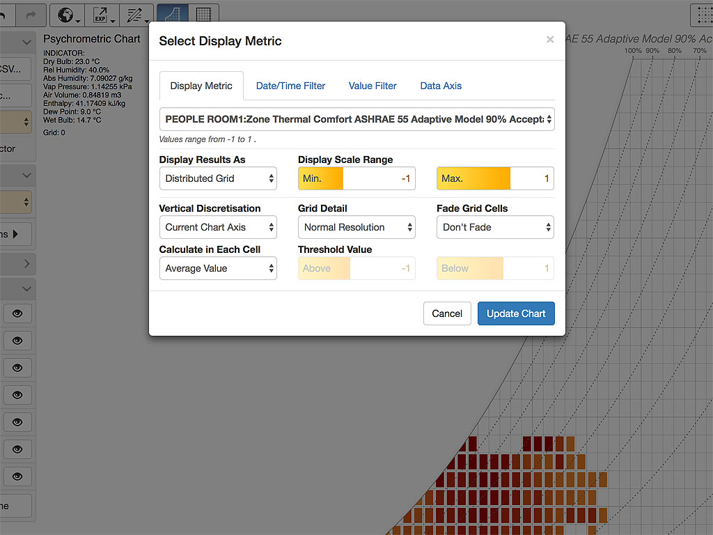
The default metric displayed when first showing grid data is the frequency distribution of temperature and humidity. This is essentially the number of unique data points within the area of the chart covered by each grid cell. This is always shown in blue and is useful for understanding the range of psychrometric conditions within the data. However, you can also choose to map any other metric in the data, which you can set using the SELECT DISPLAY METRIC dialog box. This information is shown using a different colour scale.
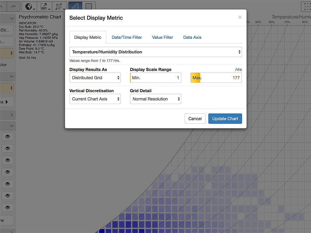
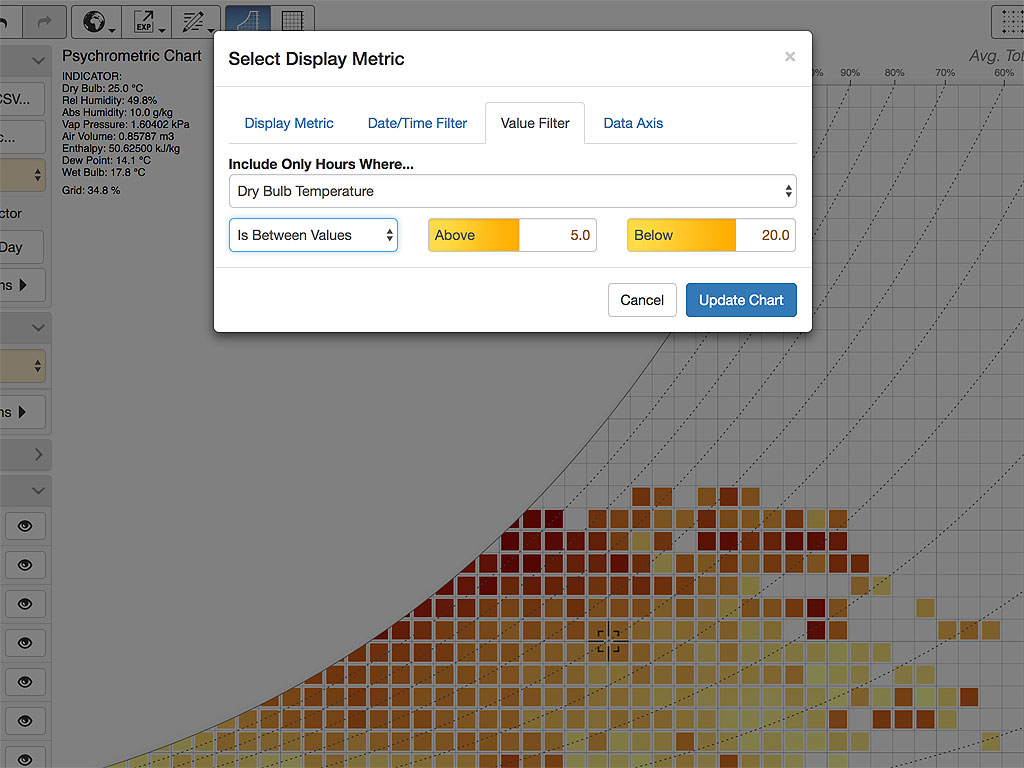
You can also choose to filter the displayed data by date and/or time range using the additional tabs in the SELECT DISPLAY METRIC dialog box, as shown in Figure 5. This also allows you to filter by day of the week, which can be important for buildings with very specific weekday or weekend occupancy. It is also possible to display an interactive date range selector beneath the chart by checking the Show Date Range Selector checkbox in the DATA MAPPING panel.
Another useful option is to filter by the value of an additional metric different to the one being displayed. For example, you could display wind speeds only during daylight hour by setting the value filter to Global Horizontal Solar Radiation and being for values above 25W/m2, or only when the Wind Direction is between 45 and 135 degrees.

The final option is being able to select different temperature and humidity metrics for use when position mapping hourly data points. This is particularly useful when analysing EnergyPlus/OpenStudio annual hourly simulation results, allowing you to map data based on the temperature of specific zones or surfaces, or on internal humidity levels instead of outdoor.

Comfort Overlays
Once you have data displayed, you can then optionally overlay a range of comfort information on top of it. This gives more meaning to the data and, especially with detailed hourly weather values, can potentially give some insight into the most appropriate design responses for that climate. One of the best tools for this is the Givoni-Milne Bioclimatic Chart which shows potential extensions of the comfort zone resulting from building design characteristics such as solar gains, the use of internal thermal mass or heating, cooling and ventilation strategies. To show this overlay, select the Givoni Bioclimatic Chart item in the COMFORT OVERLAY panel.

Having previously taught psychrometrics to architects, I always found it challenging to convincingly explain why the psychrometric chart used humidity ratio or absolute humidity in the vertical axis instead of the more familiar metric of relative humidity, and why it was so important to understand the various metric lines. Thus, one of the reasons for developing this tool was to see if I could morph seamlessly between the standard psychrometric chart and the much simpler relative humidity chart. The hope was that by simply animating back and forth between the two chart types, most of that explanation would become pretty obvious as you get to see clearly almost all of the psychrometric processes change from straight lines under the absolute humidity axis to complex curvilinear lines under relative humidity.
A by-product of this transition is that bioclimatic regions, when viewed against relative humidity, become a reasonably recognisable 90° rotated version of the original Olgyay bioclimatic chart , which helps in understanding the contribution of Givoni and Milne .
Absolute Humidity vs Humidity Ratio
At this point it is probably worth noting the issues associated with using the term absolute humidity to describe the vertical axis. I understand that humidity ratio is probably a more technically correct definition as some argue that absolute humidity is too general as it could potentially be used to cover a range of measures, humidity ratio and vapour pressure included as they are both absolute measures of humidity. However as one of my aims with this tool is to highlight the differences between using relative and absolute humidity, I would argue that it is a widely used term that, as long as the units being used to measure it are clearly displayed, is sufficiently well understood to warrant its use as a lexical counterpoint to relative humidity.
Other Comfort Measures
In addition to the bioclimatic chart, you can also overlay the Heat Index , Predicted Mean Vote (PMV) , ASHRAE Standard 55 comfort classes and EN-15251 comfort categories, as shown in Figure 8.
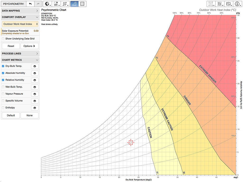

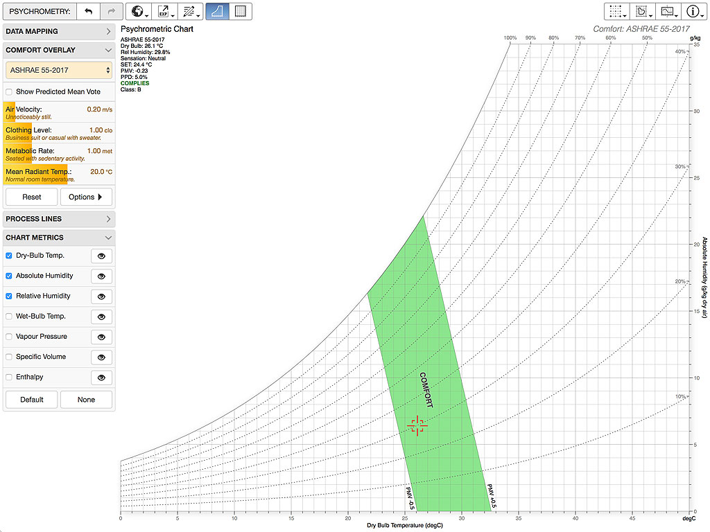
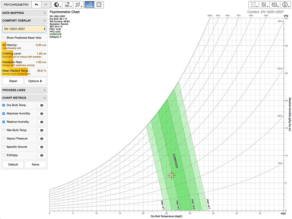
Each of these overlays are generated as contours of an underlying grid of comfort values calculated over the whole chart. You can opt to view this comfort grid by checking the Show Underlying Grid or Show Predicted Mean Vote checkboxes in the COMFORT OVERLAY panel. Additional parameters that govern these comfort values are displayed as dynamic sliders immediately beneath the selector. Press and drag any slider to adjust its value or double-press to display a numeric value editor as a popover.
Process Lines
In addition to comfort data, you can also overlay lines that represent standard psychrometric processes such as sensible heating and cooling or humidification, etc. These lines project from the current indicator position and update automatically and dynamically whenever the indicator position is changed.
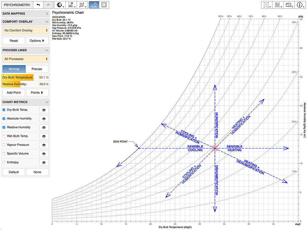

You can also add and edit your own points within the chart to create custom annotated process lines. These can be created manually, saved or imported back in. To create a process line, first position the current indicator where you need it and then press the Add Point button in the PROCESS LINES panel. Do this for each process point to create the line you require. You can press and drag any existing point within the chart or use the EDIT PROCESS POINTS popover to select and edit them manually.
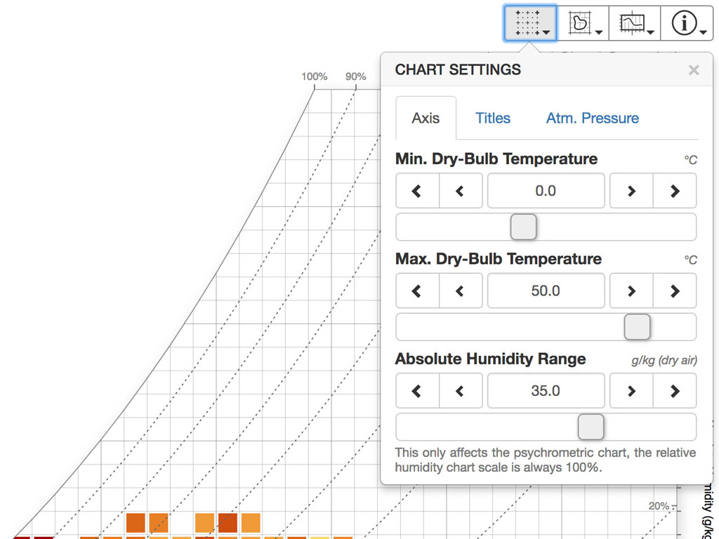
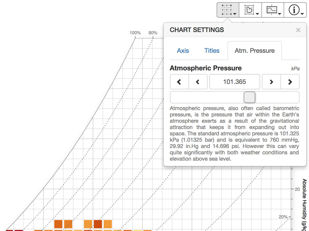
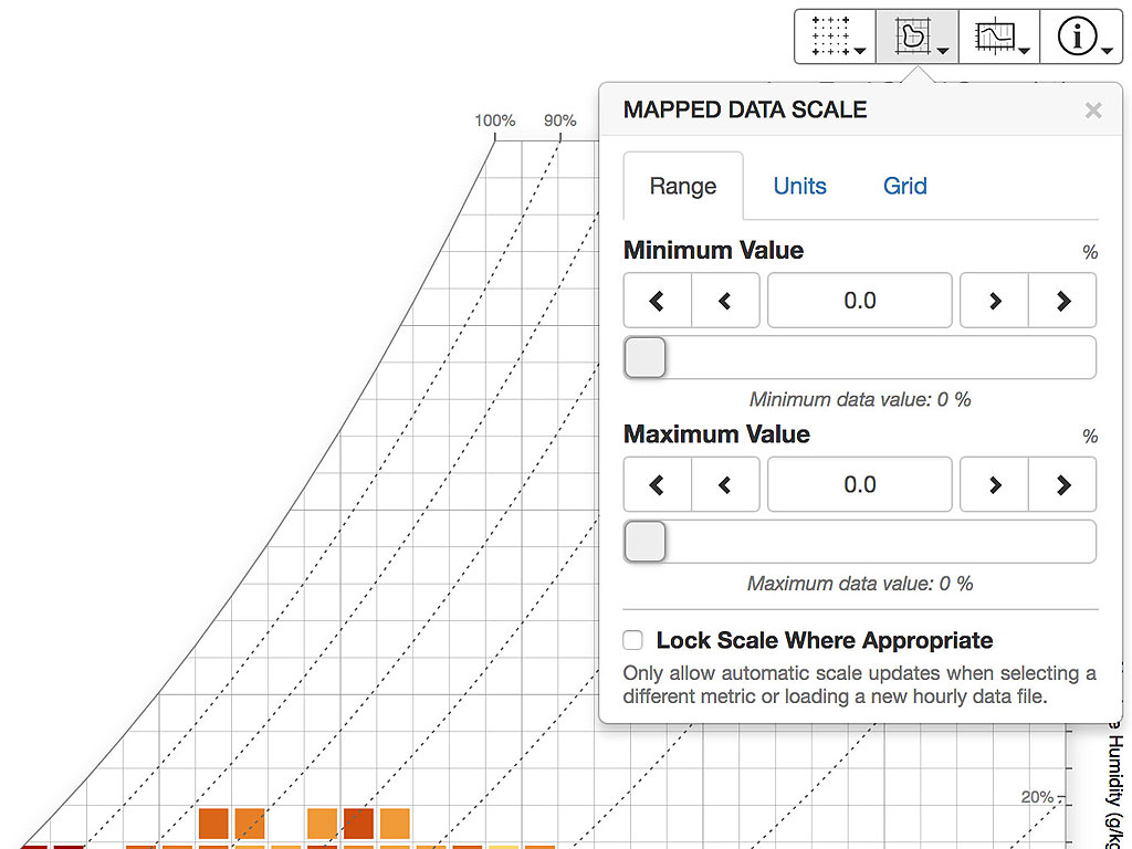
Chart Settings
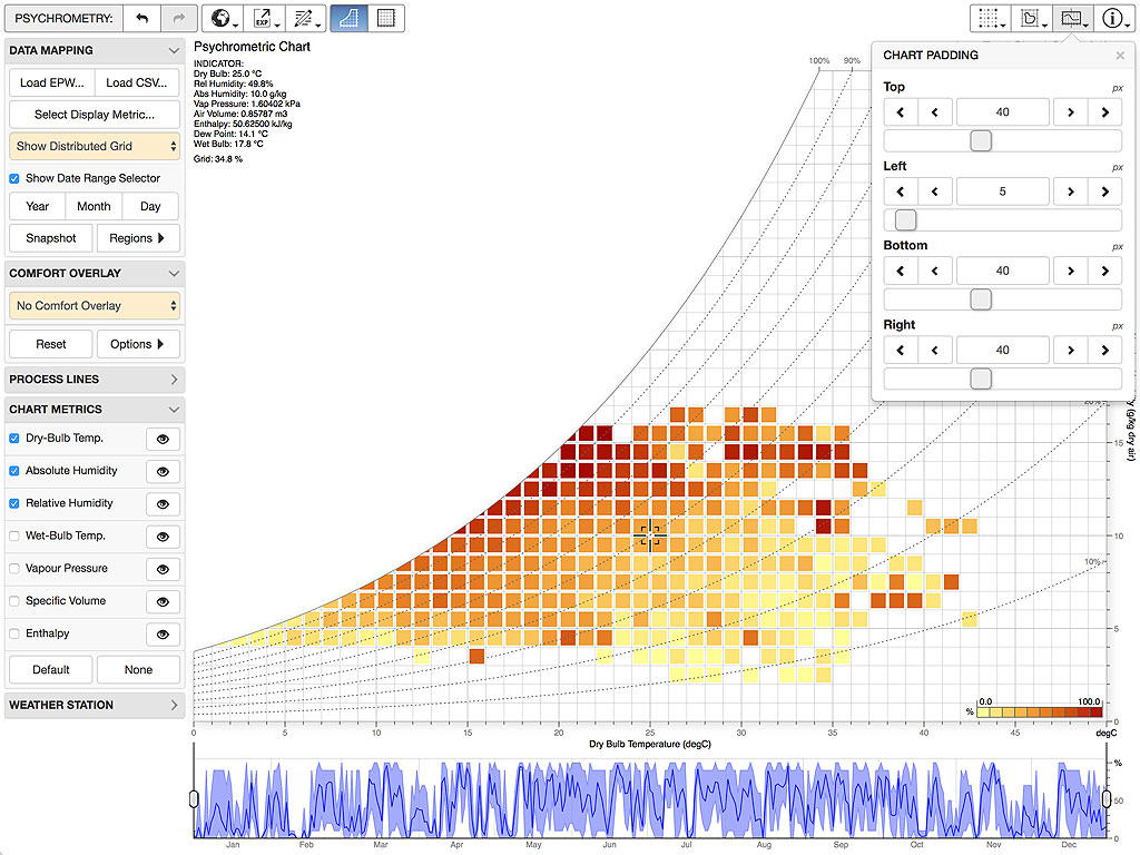
The app also allows some customisation and refinement of how it is displayed and some of the visual presentation. This includes being able to set the chart extents, titles and data scales, as well as padding and grid cell gaps.

Change Log
0.0.3 2019-08-03
Added a checkbox in the PROCESS LINES panel to toggle the position indicator on and off. This is the small cursor that you can interactively drag around the chart to show the psychrometric conditions at that point. When off, the data values shown in the top-left of the chart are also hidden. The displayed points then show the average hourly values over the currently selected period.
Updated the Show Daily Outline overlay so that it shows hourly data points averaged over the current date period. Previously, selecting this overlay would lock the date range to a single day. Now selecting this overlay will automatically set the date range to a single day, but you can then choose a multi-day time range using the date range buttons (Year, Month, Day) or by dragging the handles in the date range selector.
When displaying a comfort overlay with data points loaded, you can now generate a short report showing the number and percentage of points inside and outside the displays comfort band(s). This is available in the Report tab in the COMFORT OPTIONS dialog that is displayed when you click the Options > button in the COMFORT OVERLAY panel.
0.0.2 2019-01-21
Added support for displaying both imperial and metric units in the chart and when importing/exporting data. Whilst you can select from several different metric and imperial units for each measure by clicking the UNITS button in the top-right button bar, based on the feedback I received and looking at other charts, I have set the default imperial units to be
°Ffor temperature,gr/lbfor absolute humidity,Psifor vapour pressure,ft3/lbfor specific volume,Btu/lbfor enthalpy andft/sfor air velocity.Updated the pyschrometric calculations and validated them against those in Chapter 1 of the ASHRAE Handbook - Fundamentals (2017).
Added the P key as a keyboard shortcut for adding a new process point at the current indicator position.
Changed the value editor popup activation for orange value sliders from a double click/tap to a single click/tap. This editor allows you manually enter values for each slider using the system keyboard or small calculator buttons.
Fixed an issue with touch input where dragging the indicator to a new position after adding a process point moved the previously added point as well as the indicator.
0.0.1 2018-10-30
- Initial release.
Comments
Dick Meehan
This and your other projects are great examples of high diligence and skill at presenting a confusing subject. Thanks for the effort. Very helpful in my efforts to seek paths toward moderation in air conditioning use here in SE Asia.
One question: is there some info on data format to import spreadsheet data from non EnergyPlus sources? I collect my date via Netatmo but don’t know how to set it up to paste or import into the blank data import panel.
Dr. Andrew Marsh
Hi Dick,
Can I first sincerely apologise for taking so long to get back to you.
As you say, you can load in CSV data by simply pasting it into the text area in the import dialog. To do this, it is important that the data only has a single header line defining all the columns, such as:
    Date/Time,Drybulb Temperature [C],Relative Humidity [%]
    01/01  01:00:00,12.6375,84.0
    01/01  02:00:00,13.7735,88.8
    ...
Apart from having the date/time first, there can be any number of columns, in any order and with any title. The [C] and [%] bits in the column names within the header are useful as anything in square brackets is taken to be the units and the tool can use them to automatically tell which of the columns contain the reference temperature and relative humidity values that it can map all the other data to. You can select them later in the Select Display Metric : Data Axis tab, but it’s not even obvious that it’s there.
Also, you must have a full annual hourly data set with at least 8760 lines for it to load automatically. If not, make sure you select the “First Column as Standard Date” item at the bottom of the import dialog. Then, any unassigned hours will default to zero values.
Hope that helps…
Kind regards,
Andrew
Monica Cowan
Hi Andrew,
First of all, great tool - look forward to using it! Wanted to give you some feedback on IP units to use. I’d recommend looking at ASHRAE-published psychrometric charts to see which units are used. For enthalpy, it’s industry standard to use BTU per pound of dry air. Vapor pressure would be inches of mercury. Please reach out if you have other questions - would love to help!
Dr. Andrew Marsh
Hi Monica,
Thanks for your info, and your offer of help…
I just spent the recent break hacking through chapters 1 and 9 of the latest ASHRAE Handbook (2017), updating my code and implementing the IP equations. Once I was mostly done, I was looking around for a way to check and validate my changes when I noticed that the people who wrote PsychroLib had just done pretty well exactly the same thing in late November, and had unified SI and IP units together.
I thought about just referencing their libraries, but there were a couple of optimisations I wanted to keep and I needed to calculate dew point without requiring a specific dry-bulb. However, I decided to use their library in my unit tests so it’s great to have such a solid reference to validate against.
Thus, I think I’m mostly done on the actual psychrometrics. The reason it takes so long is that there is a heap of work to do with both the comfort and data overlays. Weather data is relatively easy to deal with as the units of each data field are known, but this isn’t always the case when importing EnergyPlus/CSV files, so I still have to generate a bunch of test output in EnergyPlus and check that.
Questions:
Having gone back through everything with a fine tooth comb, I have a couple of potentially interesting (or potentially embarrassing) questions that you or someone else may be able to answer.
Why are temperature lines in some charts not vertical?
In a lot of the psychrometric charts I have looked at, the lines of dry-bulb temperature don’t always run vertically up the chart, but rather lean to the left slightly, having more of a lean at lower temperatures and less at higher. As the saturation line is defined by temperature and humidity ratio, you could in theory skew or splay either axis in any way you want. Thus, I guess the the question is, why splay it like that? The only thing I can think of is that it may make reading off sensible heat ratio a bit easier, but I have yet to find any reference for that.How valid is it to map hourly weather data points on a psychrometric chart?
All of the psychrometric relationships on the chart are dependant on atmospheric pressure. If you change that, the whole shape of the chart changes slightly. However, atmospheric pressure is quite dynamic, so every hourly weather data point has its own specific value for atmospheric pressure. Obviously there is no point generating a different psychrometric chart for each hourly data point as you really need to see them distributed over a single chart in order to gain any useful insight. However, you can’t use their individual atmospheric pressures when plotting each point on the chart as you will get some points lying above the saturation line and their relationships to absolute and relative humidity will be deceptive. In my case, I use what seems to be the accepted approach of plotting them using their dry-bulb and relative humidity values, based on the psychrometric relationships in the displayed chart.
Sorry for the long response, but I’m right in the middle of all this at the moment so it was just a brain dump.
Kind regards,
Andrew
Dr. Andrew Marsh
Imperial units now supported - see Change Log for details. Just refresh the app in your
browser if you don’t see a new Units button.
Kind regards,
Andrew
annie mroz
Cool tool! Is there a way to change to IP units?Eric Sowers
Looks marvelous, thank you for sharing all of this great stuff.
For some of us old fashioned Yanks, I have to ask if there is any plan to include imperial units (Fahrenheit, for example).
Dr. Andrew Marsh
Hi Eric and Annie,
I will absolutely add an option for imperial units, but it may take a couple of weeks as there is a lot of stuff to check and get right.
I did ask some people I knew in the US about Imperial Units, but they all said pretty well everyone now used SI when dealing with Psychrometrics. I obviously have to get out more and meet new people.
I did build in most of the infrastructure for different units, but it can get quite complex when importing data and showing overlays. To get things like the bioclimatic regions to look right, you have to snap the overlay to the current temperature/humidity grid, so I’ll have to do some experimentation first.
I’ll also need to do a bit more research to make sure I choose all the right IP units. Just a quick search for pressure already brings up lbf/ft², psi, ozf/in², iwc, inHg and ftHg as options.
Thus, any guidance or suggestions for exactly which IP units to use for stuff like enthalpy and vapour pressure would be gratefully accepted.
Kind regards,
Andrew
Dr. Andrew Marsh
Imperial units now supported - see Change Log for details. Just refresh the app in your
browser if you don’t see a new Units button.
Kind regards,
Andrew